homefavorite
Sections

Feature section inspiration

Discover feature section examples that turn product capabilities into scannable benefits, comparisons and visual explanations.

164 references

Browse references
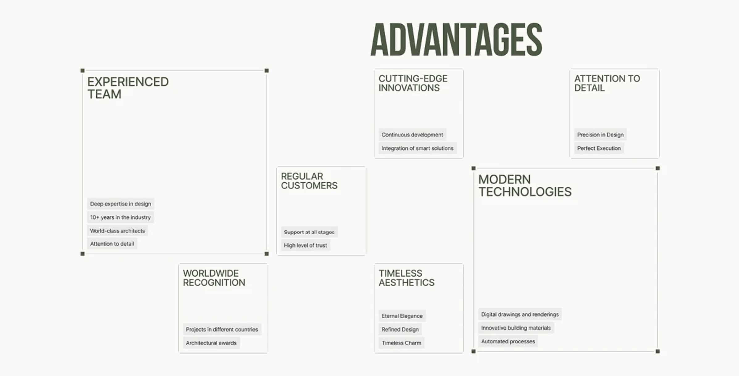
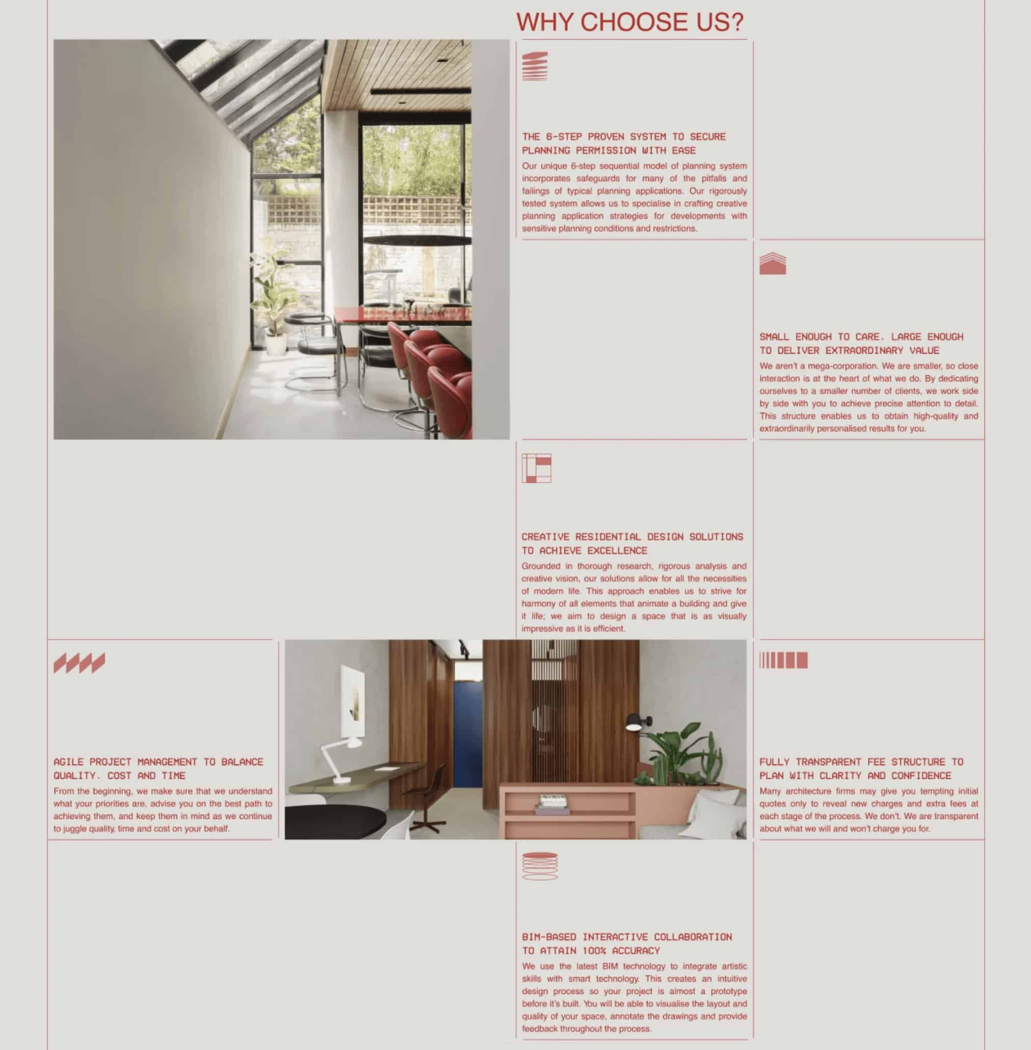
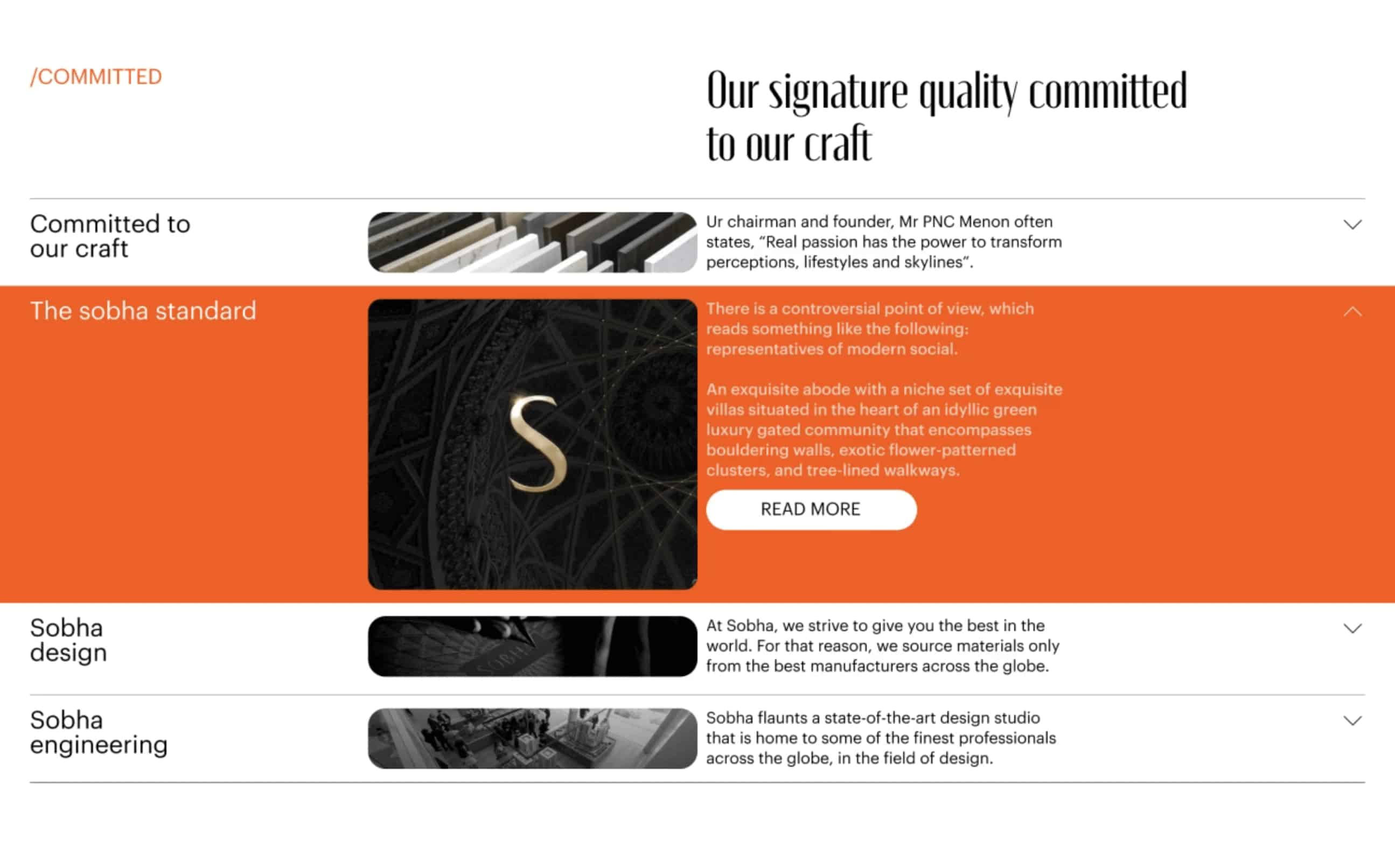
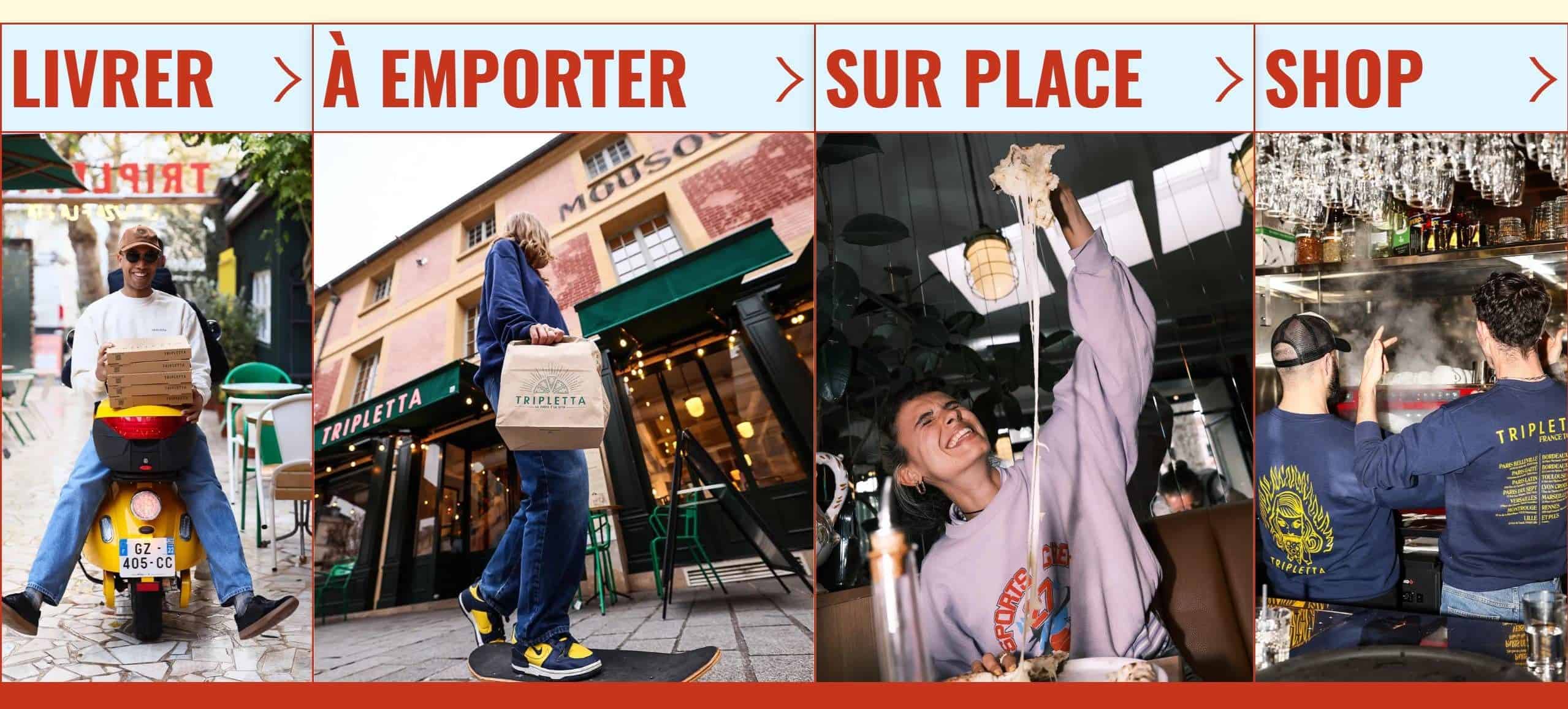
Three tall rounded panels under a bold Community Bulletin Board header, center panel expanded with dense orange text.Two-column hero layout with rounded sky image and translucent rounded button on the left and a tall right column with serif headline and supporting text.A layout with rounded tiles in the upper right containing app icons; large text on the left reads Upload Your Data; a subtitle connects apps across the grid.Four-panel restaurant service grid showing scooter delivery, curbside pickup, a customer pulling cheesy pizza, and two chefs in a kitchen.Webpage hero for e-gift cards with headline and photo above it.A layout board showing multiple cards with bold headings such as ADVANTAGES and EXPERIENCED TEAM, arranged in a grid with white space and thin borders.

What to look for

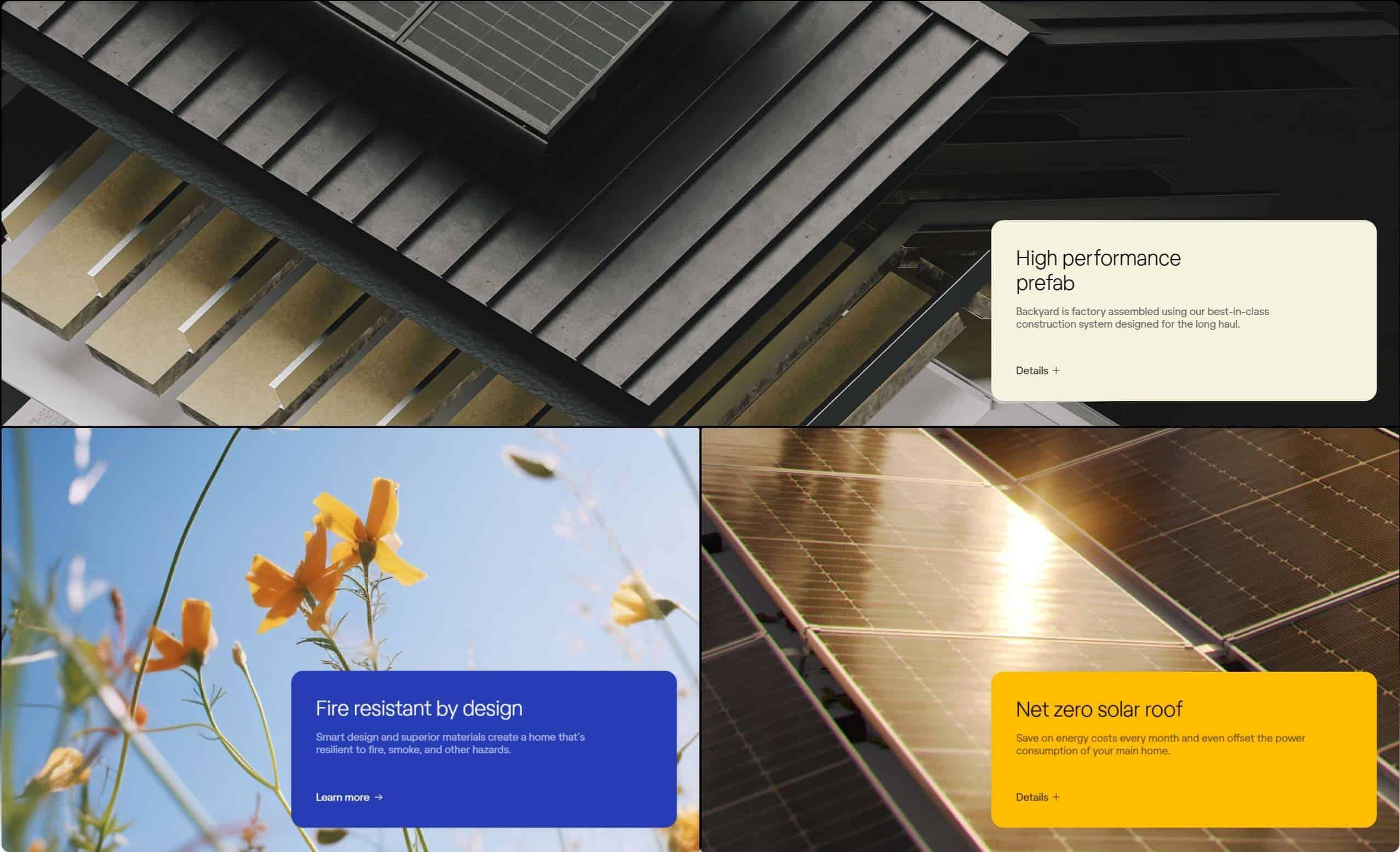
Feature sections should help people understand value before they evaluate detail. These examples organize capabilities into clear, scannable and visually connected stories.

Compare grouping, benefit-led copy, icon or image roles, progressive detail and the order in which capabilities are revealed.

Use the collection for SaaS, apps and services that need to explain several capabilities without turning the page into documentation.

Feature section inspiration

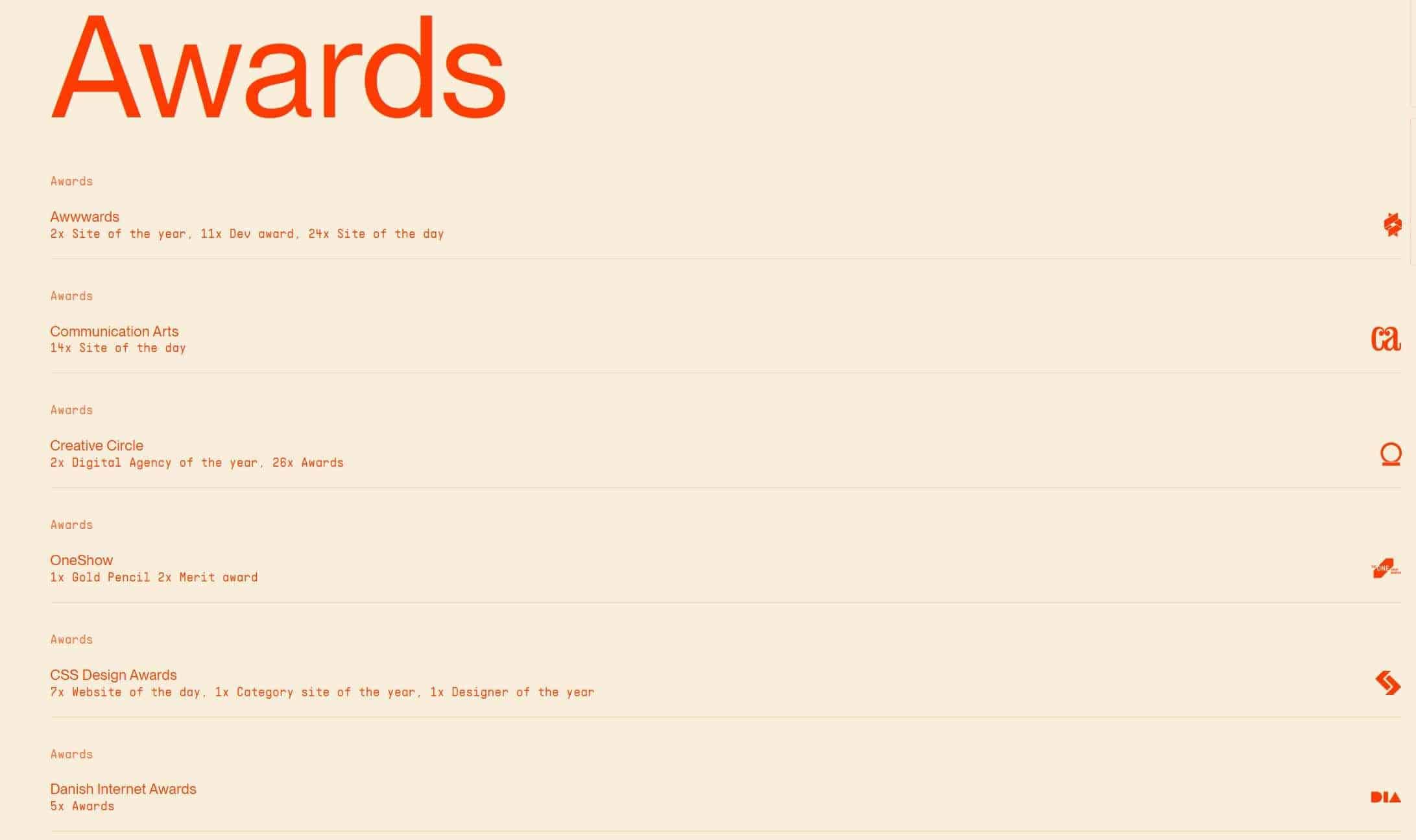
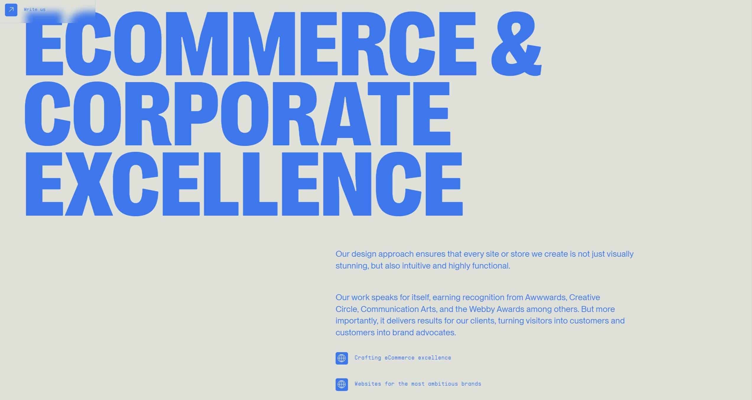
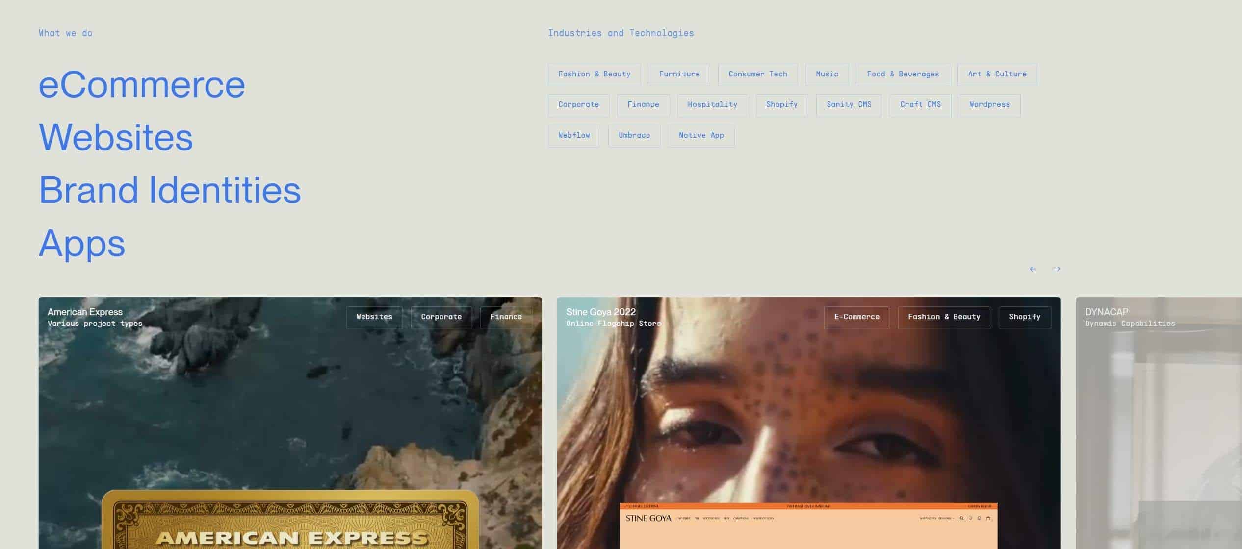
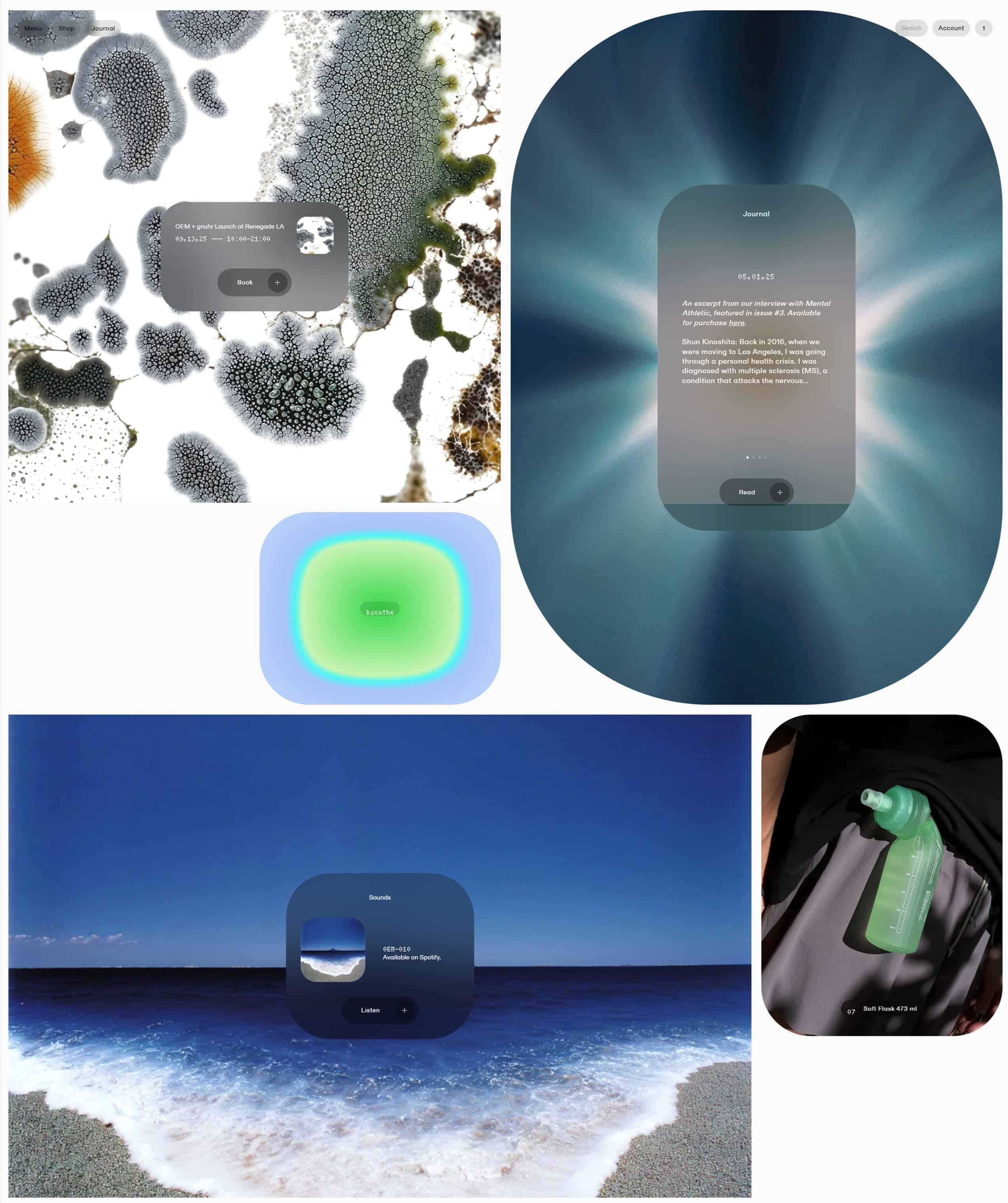
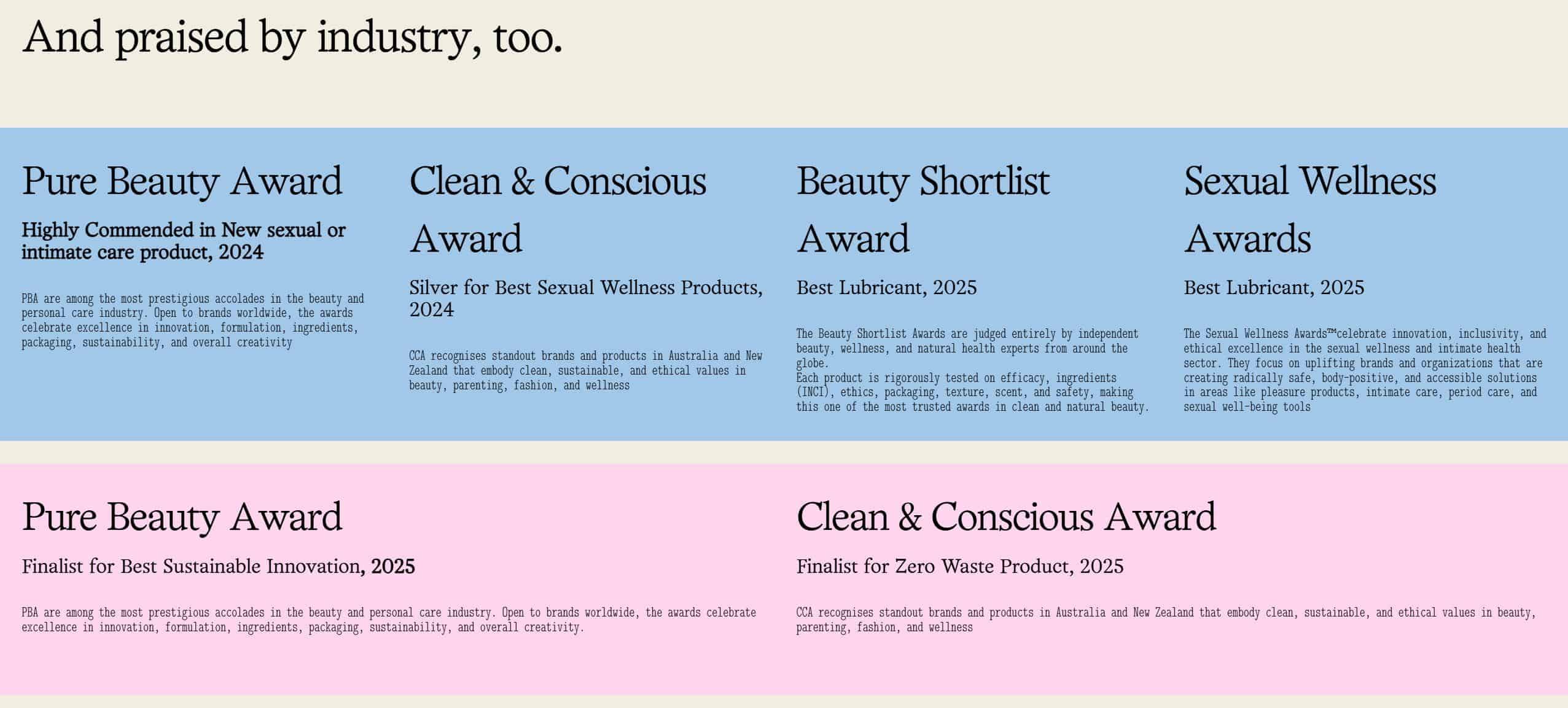
Minimal dark content panel with heading beside a person reclining and using a tablet.Four glass display boxes each holding a metallic abstract object and a dark label at the base.Horizontal carousel of rounded-rectangle photos showing music production scenes and circular navigation arrows on a dark background.Minimal webpage listing awards with large orange heading and repeated award entries on a pale background.Large blue bold typography fills the left side with a light gray background and small blue paragraph text on the right.Website portfolio layout with large left-aligned blue headings and a grid of project thumbnails at the bottom.A gallery layout showing two large title blocks with beige backgrounds and a centered square image of curved wooden chairs between them.A collage of abstract textures and a shoreline image with rounded dark panels overlay containing text blocks and buttons.A broad gallery of award logos aligned in multiple rows on a white background with a large image on the right showing a person shaping a statue head.Minimal webpage layout with a large numeral one on the left and bold headline text on the right above a small photographic collage.Large typography headline spans across the left and center, with a multi-column list of design categories fading into the background on the right side.Dark webpage layout with three rounded white cards featuring neon green and purple headers and bold headings about delivery, original products, and returns.

Related collections

Using references well

How should I use feature section inspiration in a project?

Compare grouping, benefit-led copy, icon or image roles, progressive detail and the order in which capabilities are revealed. Avoid copying a screen literally: identify the principle that solves your problem and test it with your own content.

What kind of project is this collection useful for?

Use the collection for SaaS, apps and services that need to explain several capabilities without turning the page into documentation.

Turn inspiration into a working direction

Explore the live catalog and collect the ideas that can make your next website clearer, more distinctive and easier to explain.

Browse references