homefavorite
Styles

Brutalist website inspiration

Browse brutalist website examples built with raw typography, visible grids, sharp contrast and unconventional web layouts.

50 references

Browse references
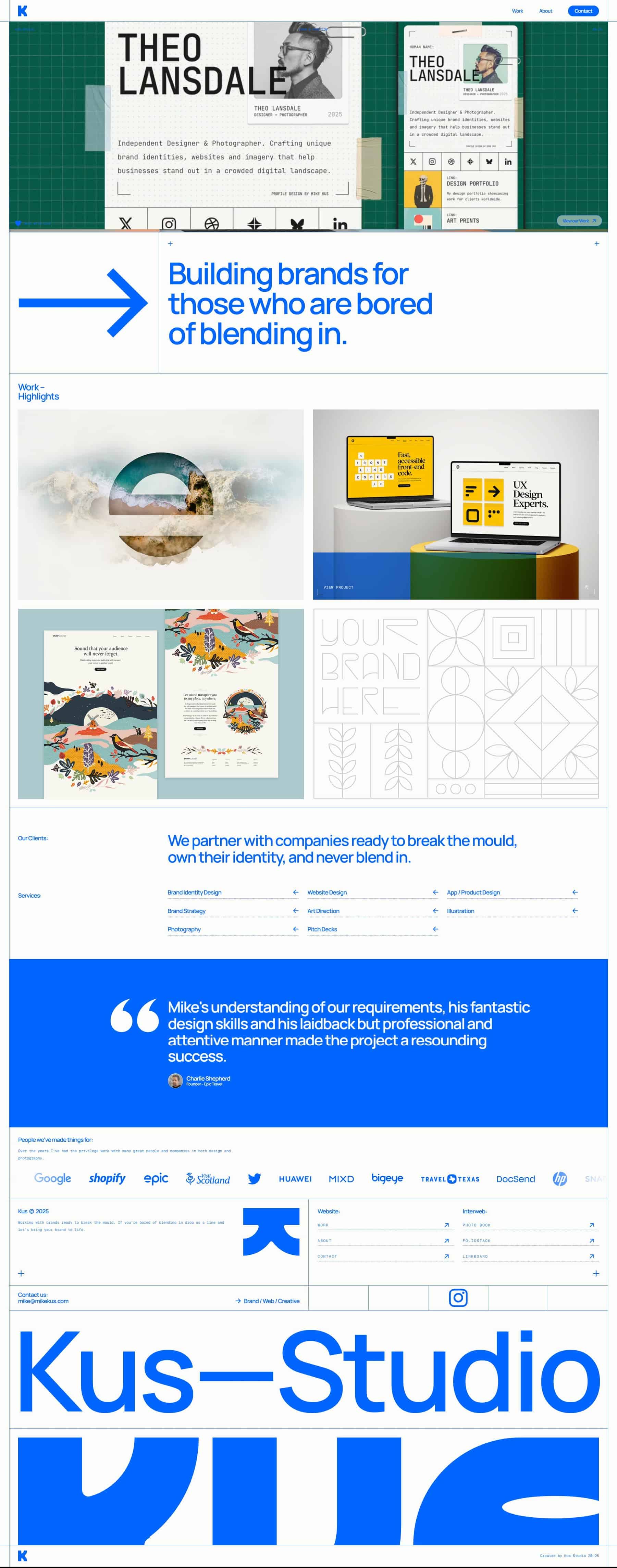
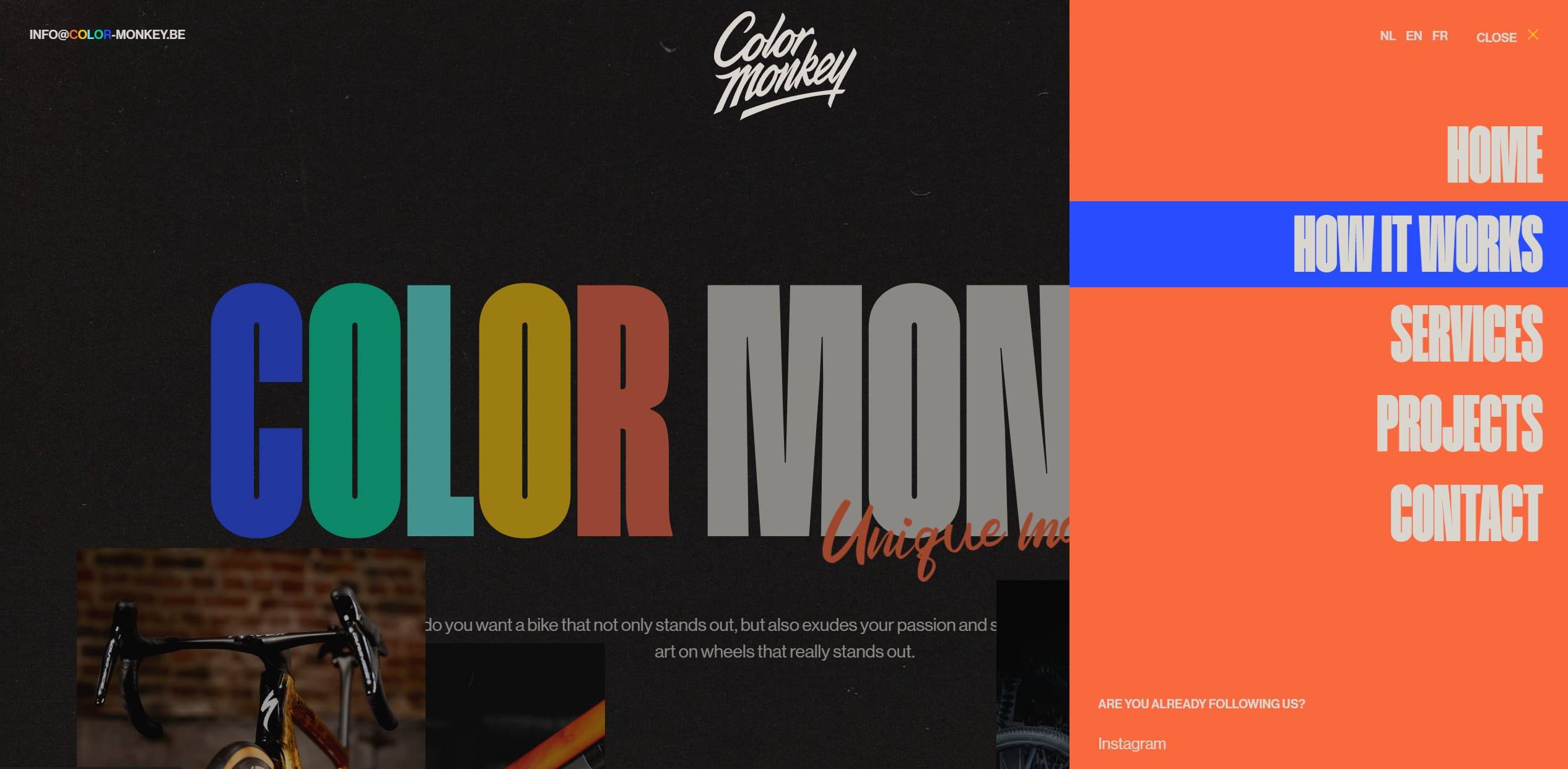
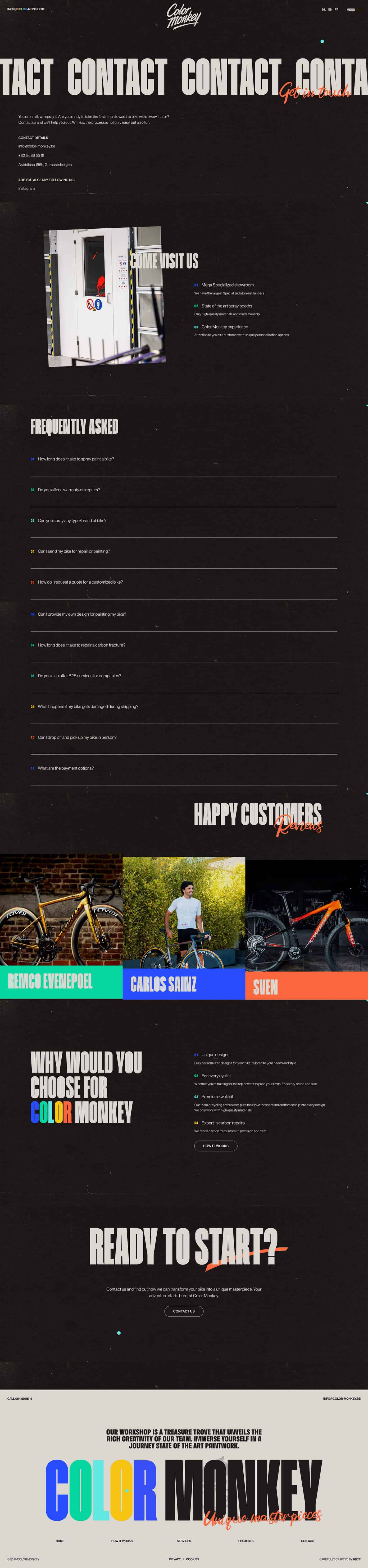
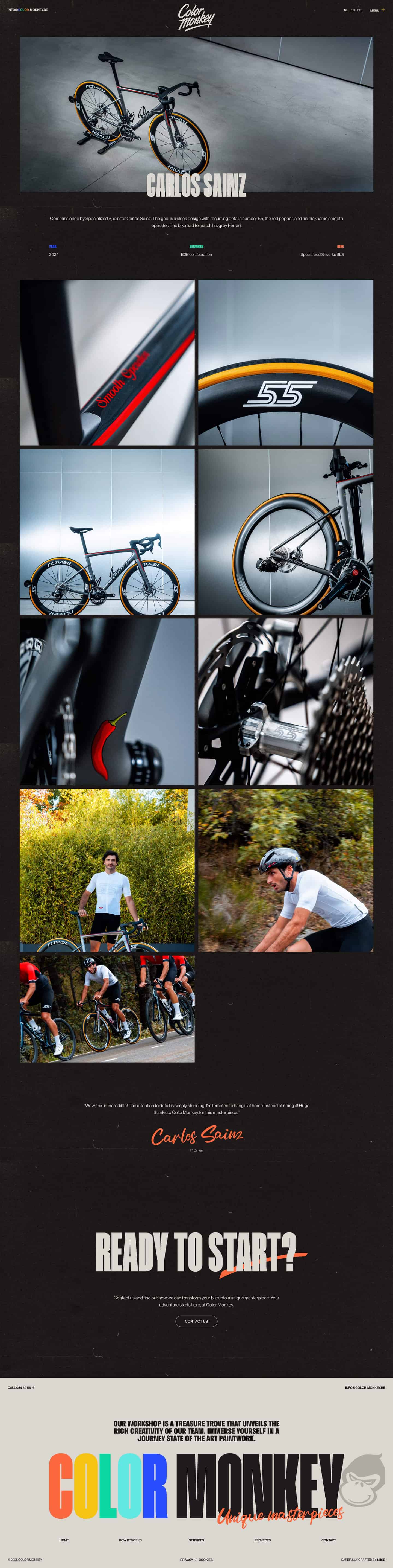
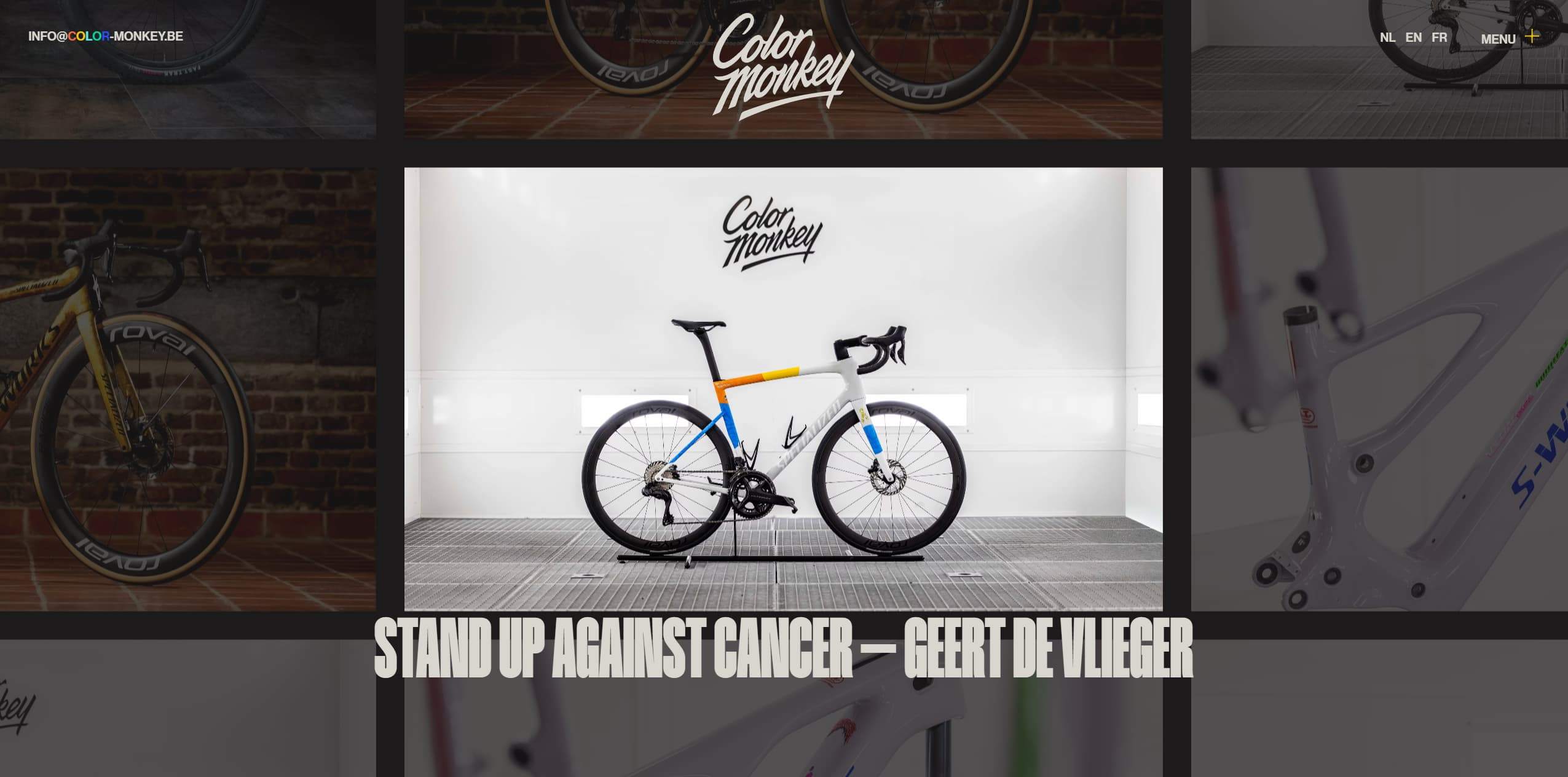
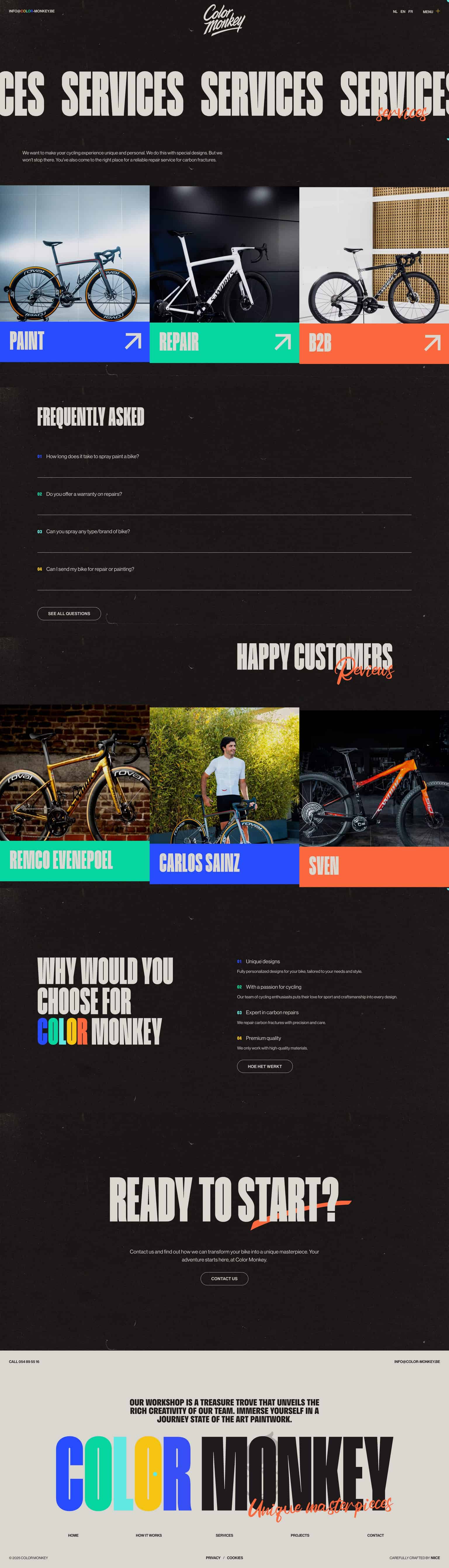
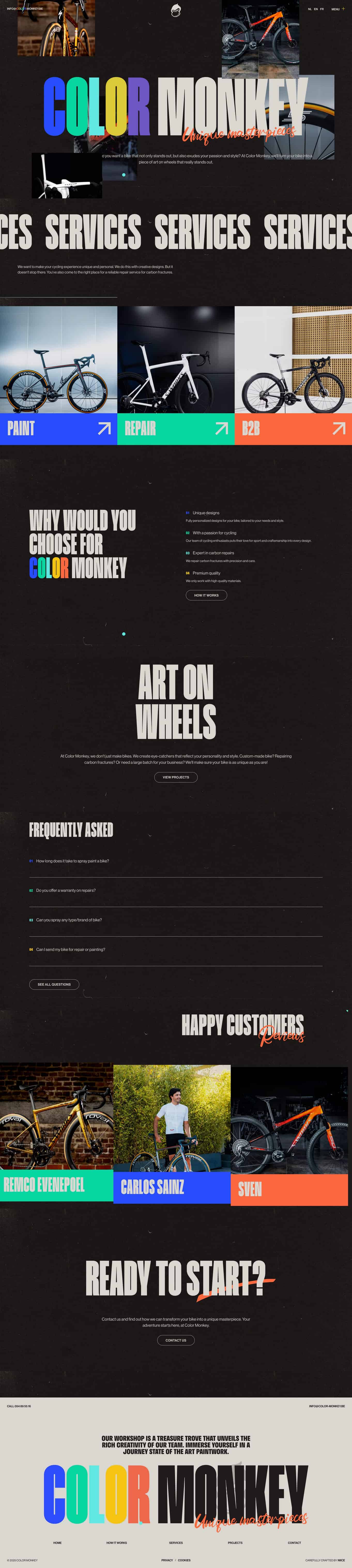
A large portfolio homepage featuring a bold hero image with blue typography and a rightward arrow motif, followed by a grid of design thumbnails and a blue testimonial block.Dark textured site background with oversized multicolored headline lettering and a tall orange right-side navigation panel listing menu items in condensed white type.Dark contact page with large repeating header, contact details, FAQ list, and customer photos.Dark portfolio webpage showing a branded road bicycle with close-up detail photos and rider images arranged in a grid.A white bicycle in a clean showroom with a Color Monkey logo on the wall above. The bike is centered with a sleek, modern frame and multicolor accents.A long vertical homepage layout featuring a bold, dark UI with large bicycle images, colored category bars for Paint, Repair, and B2B, and sections for FAQs and testimonials.

What to look for

Brutalist web design turns raw structure into a visual language. These references range from disciplined editorial systems to intentionally disruptive layouts with oversized type and hard contrast.

Notice how scale, deliberate friction, borders and direct typography create energy without making navigation ambiguous.

Use the collection for cultural projects, portfolios and brands that need a direct, experimental or anti-polished voice.

Brutalist website inspiration

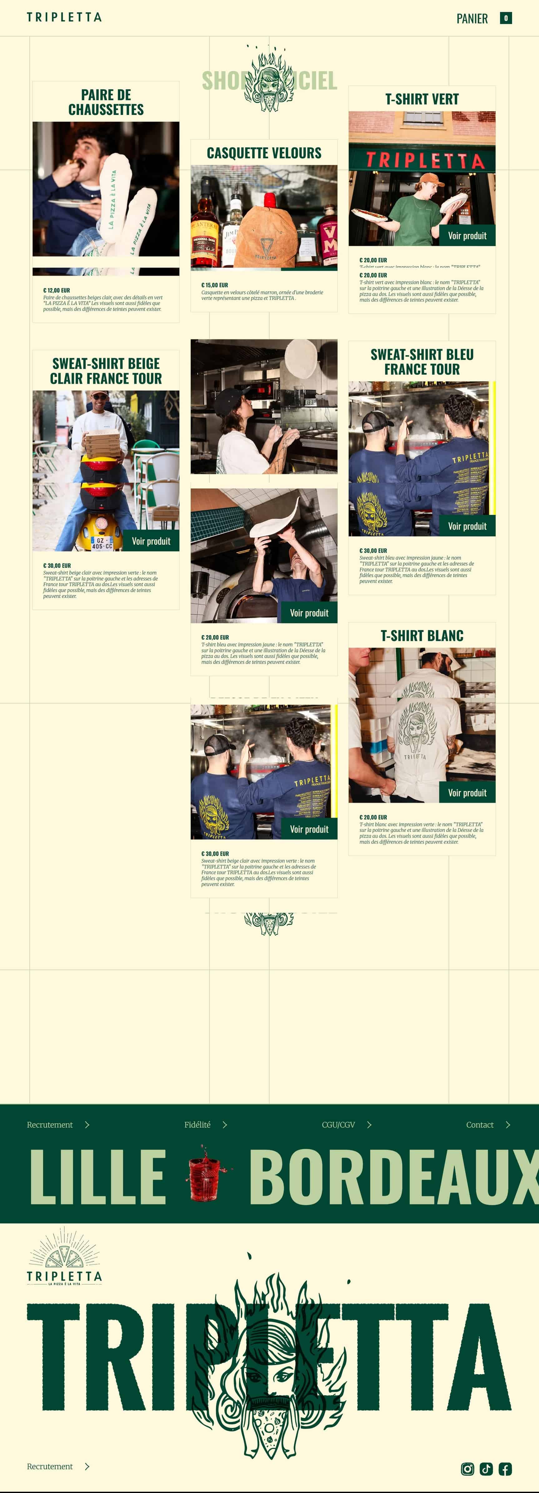
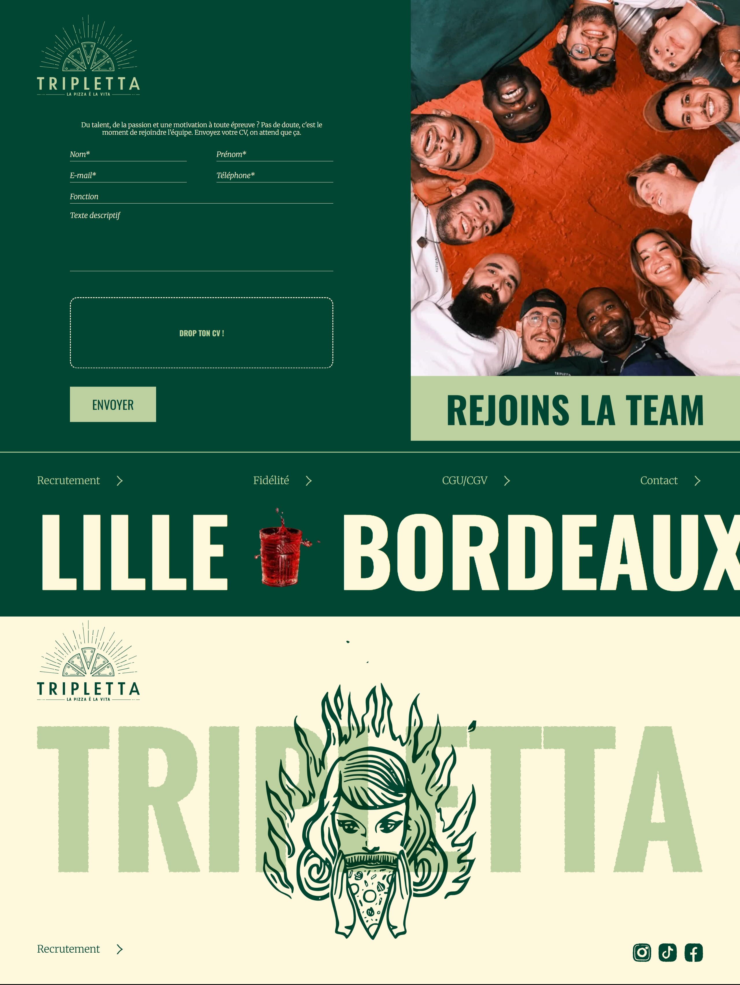
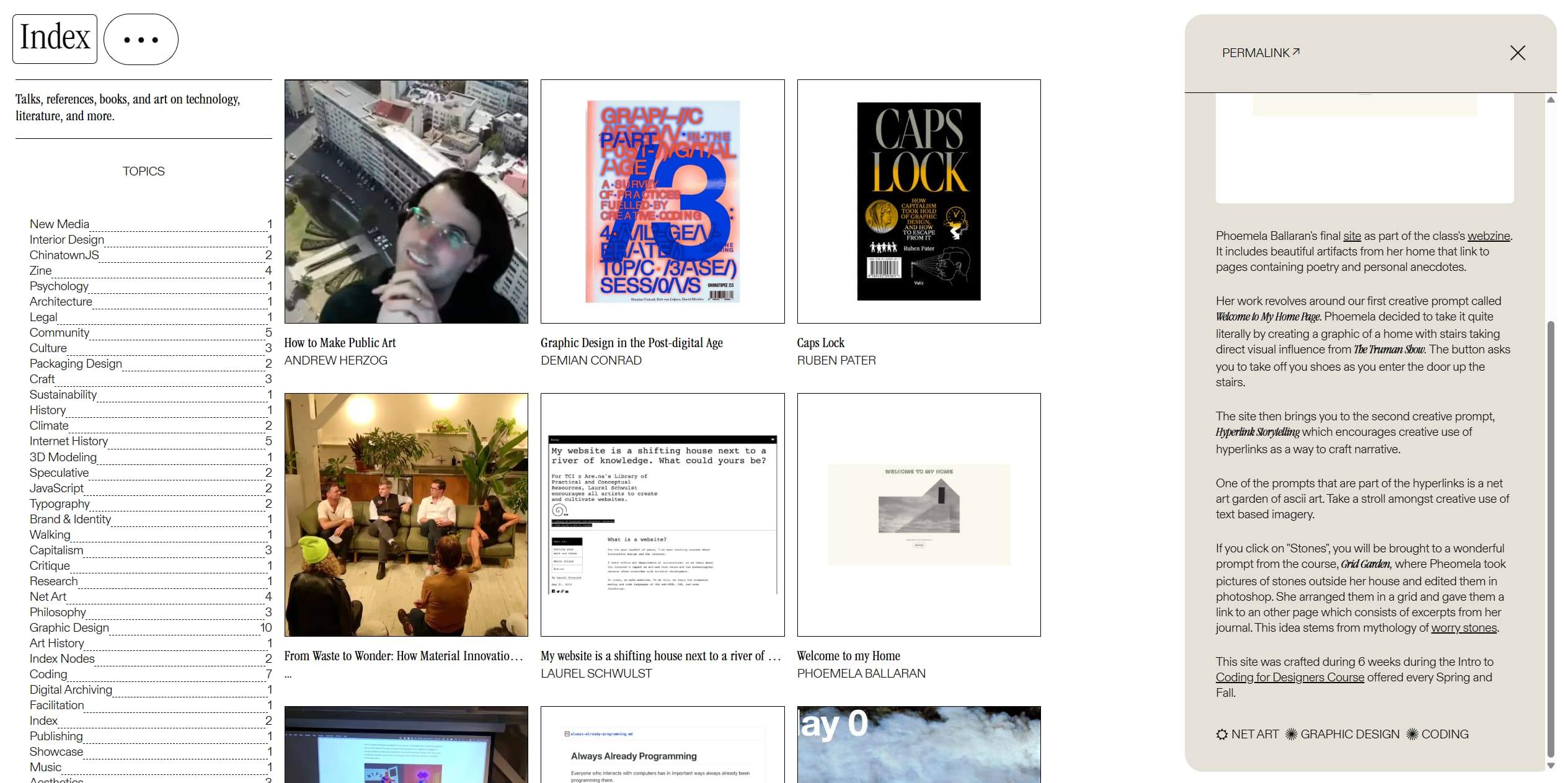
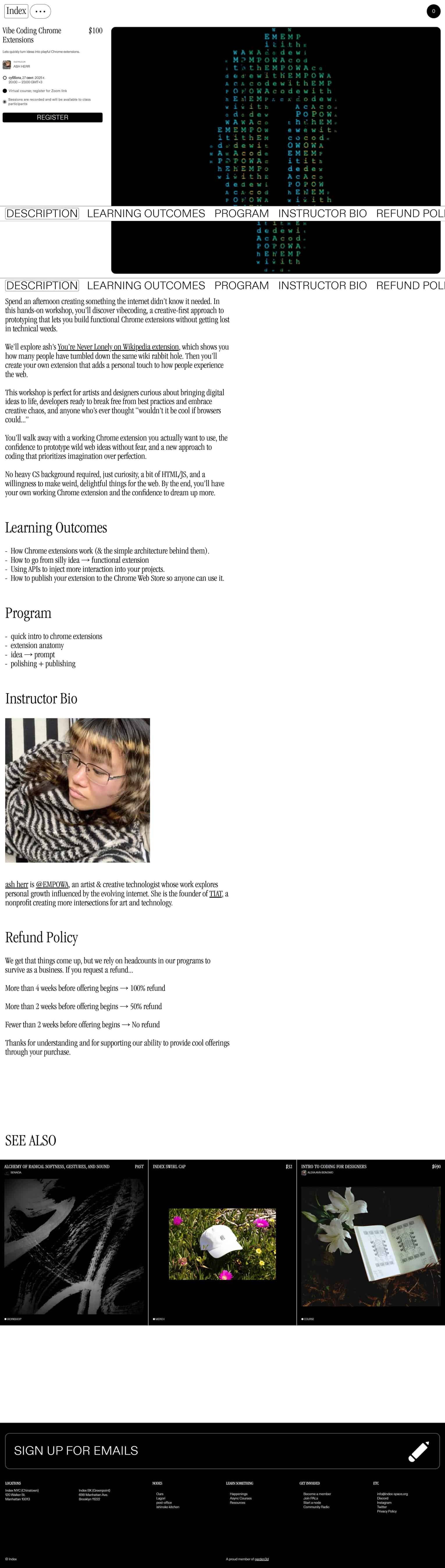
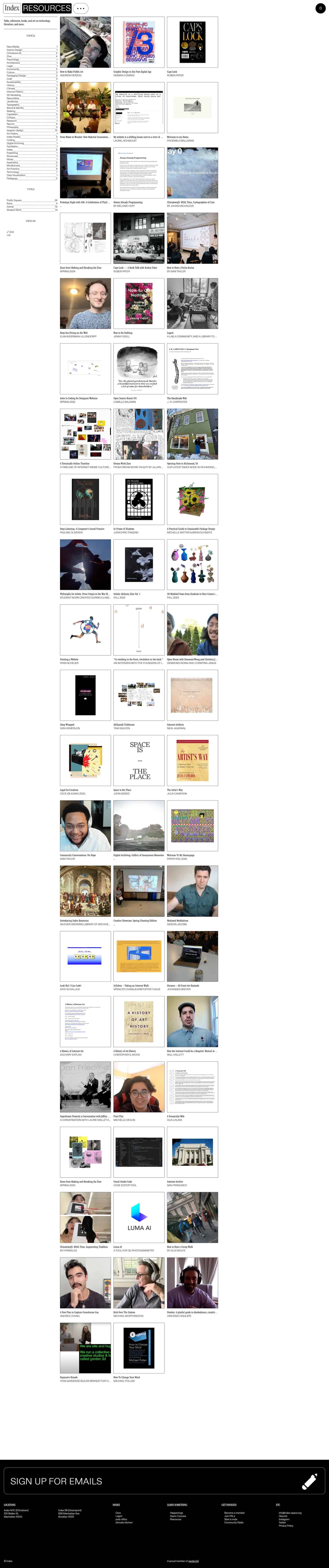
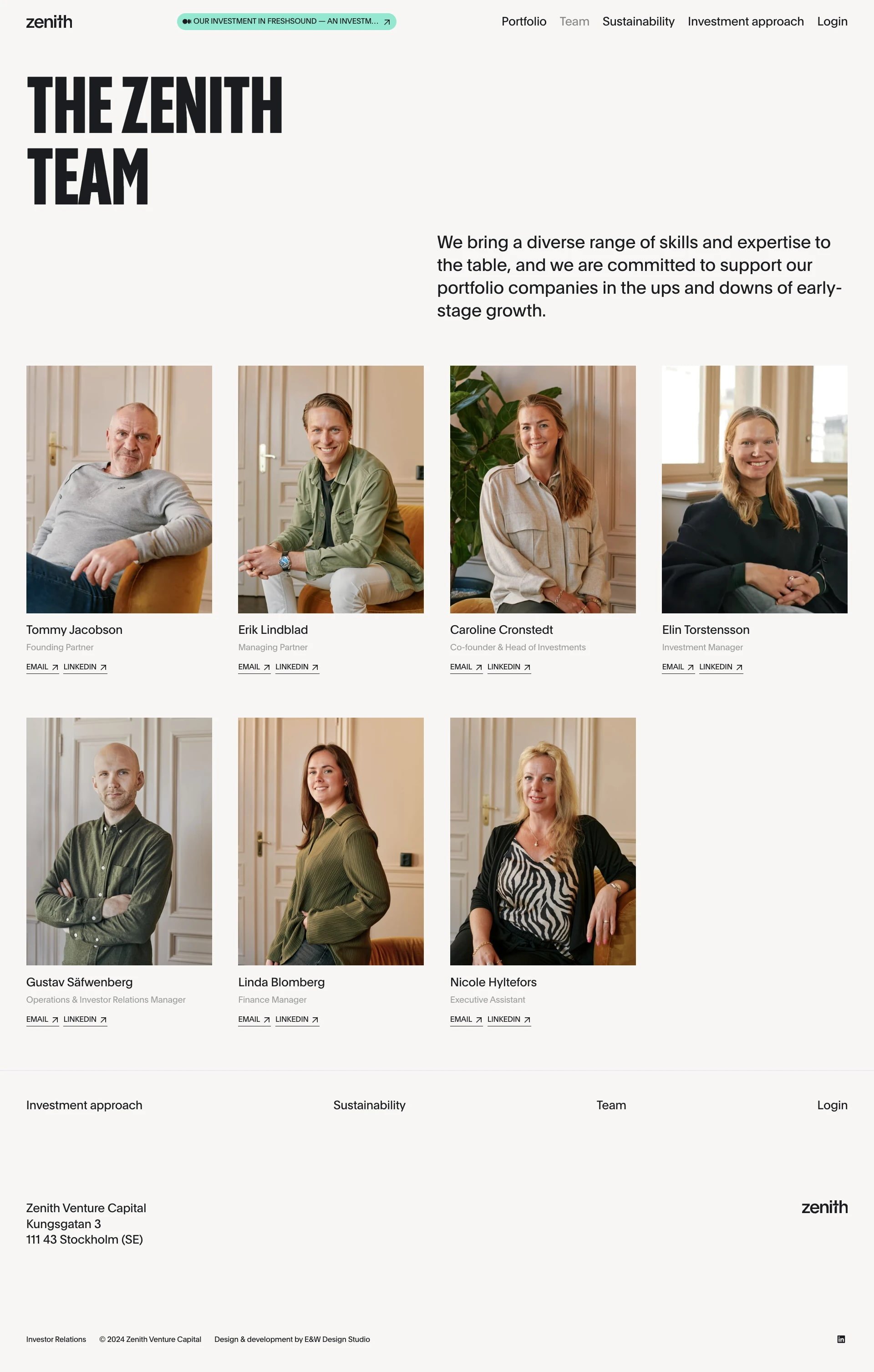
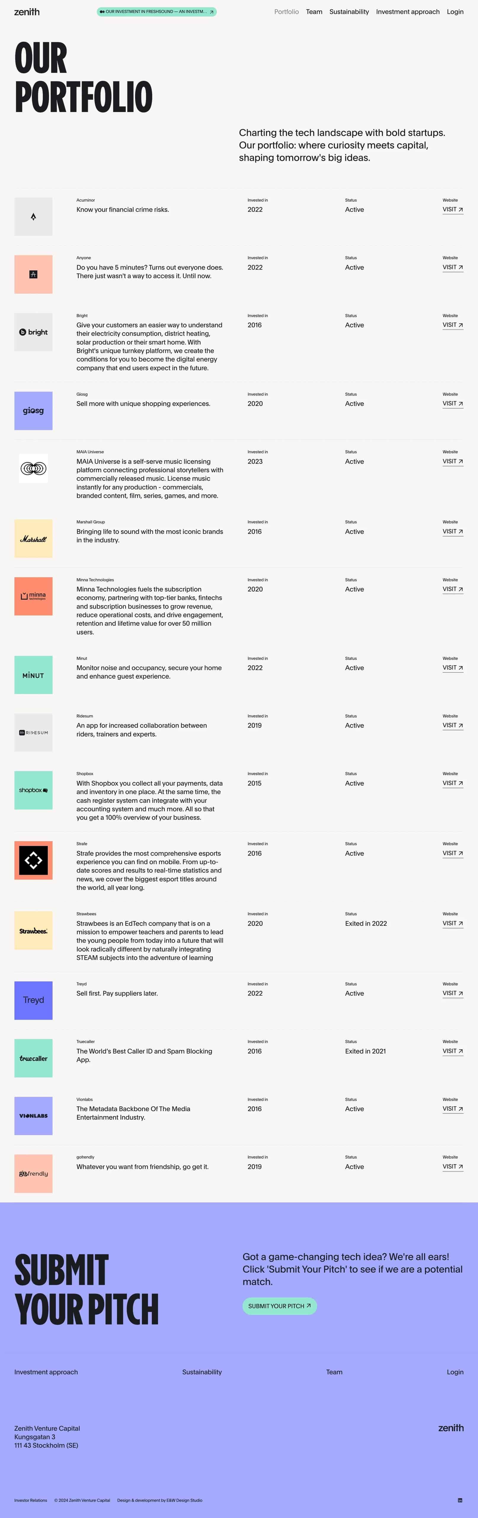
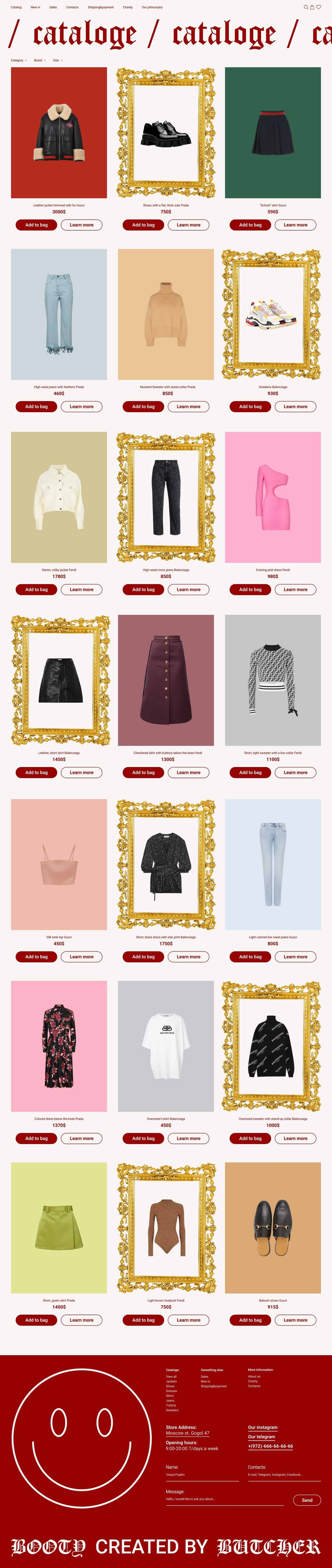
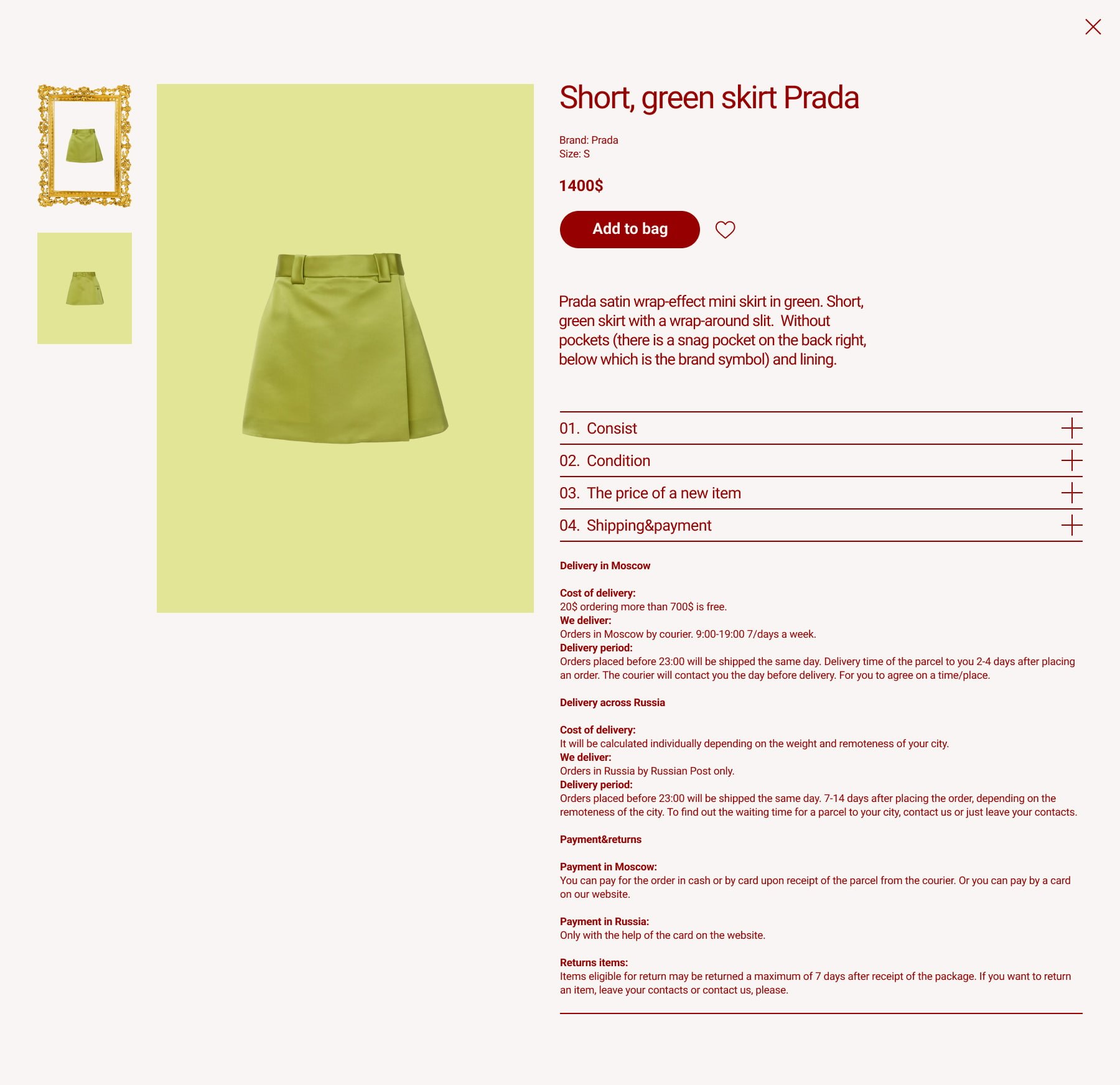
Long single-page design with large colorful heading, multiple photos of bikes and studio spaces, and bold section headers.Dark textured studio homepage with colorful wordmark and bike service tiles.A collage of product cards laid out in a grid featuring shirts, caps, and accessories with bold typography labels and product images.Group of people looking down at the camera in a circle, with a dark green left panel showing a form and a light beige right section with a photo.Three-column webpage with left index, central thumbnail grid, and right article panel.Single-column workshop page with a large dark code-art banner, left registration sidebar, tabs, details, and instructor photo.A vertical grid of small thumbnail images from a website reference, showing various articles and design samples in a masonry-like layout.Company team page with large stacked headline on the left, mission paragraph on the right, and a grid of portrait photos with names and roles below each image.Two-column venture capital portfolio webpage with company cards and logos on the right column.A grid of fashion product cards arranged in a gallery layout with ornate gold frames surrounding several product images on a two-tone background.A vertical mockup of an ecommerce site with bold red typography, large homepage hero, fashion imagery, and product grids in a brutalist, high-contrast style.Product detail page with a large pale green background showing a lime green mini skirt at center and small thumbnail images at left.

Related collections

Using references well

How should I use brutalist website inspiration in a project?
Notice how scale, deliberate friction, borders and direct typography create energy without making navigation ambiguous. Avoid copying a screen literally: identify the principle that solves your problem and test it with your own content.

What kind of project is this collection useful for?

Use the collection for cultural projects, portfolios and brands that need a direct, experimental or anti-polished voice.

Turn inspiration into a working direction

Explore the live catalog and collect the ideas that can make your next website clearer, more distinctive and easier to explain.

Browse references